Colleague Assist (Cassi)
AI Chatbot Feedback Journey


Summary
Stuck for time? Here's a quick run through...
How did I get involved?
While conducting user research with a frontline colleague, I noticed they were using Colleague Assist. The project looked really interesting and I was looking for a new challenge, so I offered my help to improve it.
What was the problem statement?
"Colleagues are not selecting their business area (audience) when querying Colleague Assist and the feedback rates are really low. This causes Colleague Assist's responses to be less accurate and prevents the data science team from improving the model."
What did my research show?
The feedback journey only allowed discrete feedback with three vague options, causing users to drop off. Additionally the start of the feedback journey and filter mechanism were poorly signalled.
Users were not aware of the importance of applying filters or providing feedback.
Why does this matter?
Colleague Assist is the strategic AI tool of choice for Santander UK. It's rolling out across all Customer Interactions teams and supports thousands of colleagues daily. Colleague Assist needed to be improved to support the increasing number of colleagues being onboarded.
What did I do?
I'd built a strong relationship with the owner of a support forum called Community, this influence allowed me to open a dedicated Cassi forum. Users now had a place to share their thoughts. The forum was owned by the Colleague Assist team who helped with queries.
I improved the signalling for filter selection and feedback options. Next. I plugged the knowledge gap with a tooltip and guidance when they open the tool. Colleagues were bought into the idea of providing feedback when they knew it directly improved the model's responses.
A competition was run to design a new logo and give the tool a new name to promote it's use and drive engagement.
What was the result?
Cassi was born! With a new name, branding, and shiny logo. The tool was now more in line with customer-facing systems.
Filter adherence is close to 100% and feedback responses increased 30%, providing more information for the model.
These changes were delivered within a strict three week window. My knowledge of HTML and CSS meant that I knew how to deploy fixes requiring low development effort so the update was classed as 'business as usual' by the development team, meaning no additional cost to the project.
Background
How did I get involved?
A new problem to solve
After delivering the main updates for i-Exchange, I was on the hunt for new problems to solve.

While conducting user research with a frontline colleague, I noticed they were using a tool called Colleague Assist. The project looked really interesting and I was looking for a new challenge, so I offered my help to improve it.
What's Colleague Assist?
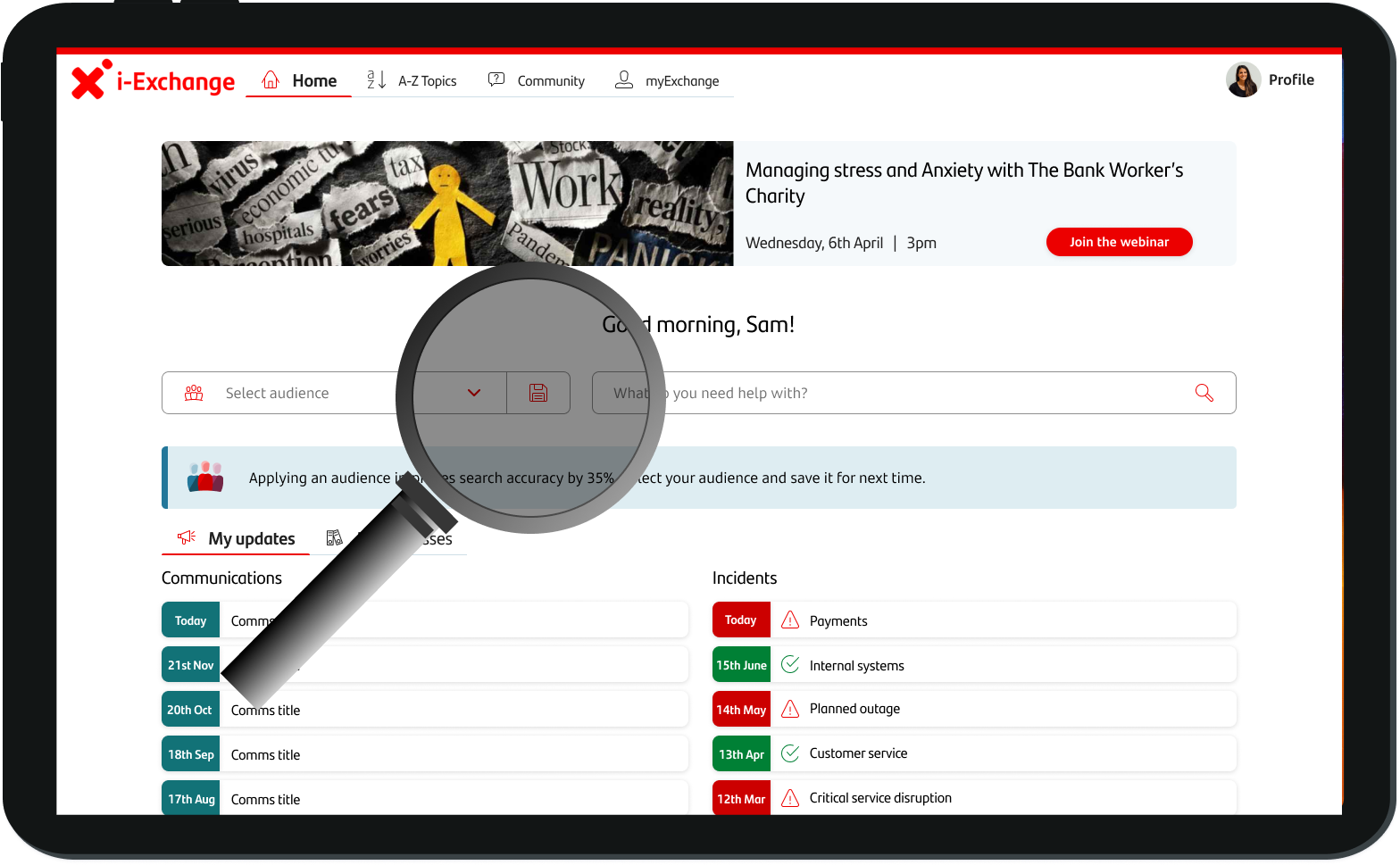
Colleague Assist is an AI chatbot that provides Santander colleagues with guidance on how to serve customers. It's a bit like ChatGPT for banking. It uses i-Exchange (Santander's internal knowledge base) as it's source of information to provide answers.
Joining the team
After speaking to the Product Owner I found out they were having trouble getting users to select their business area (audience) and only a fraction of responses were receiving feedback.

They were happy for me to join the team. However there was a big problem...
There was no money left!
The developers agreed that front end changes such as copy and styles would count as 'business as usual' and not incur additional costs, but this limited my options for updating the tool.
In addition, there was a long change freeze coming up in three weeks, so it was a race against time.
Do what you can
Functional changes in the back end were out of the question, so I focused on what we could do.
My knowledge of front end development was enough for me to understand what low cost changes I could make.
I focused on the UI, instead of trying to create any new journeys, or improve the quality of responses.
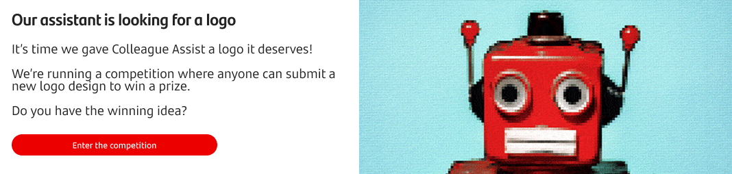
In a bid to drive engagement with colleagues, I announced a competition to design a new logo and posted a banner on i-Exchange to promote it to colleagues.
Empathise
There's always time for research.
There was no time to plan workshops, or even build a proper research plan, but there were plenty of colleagues using the platform who I could speak to.
Town hall meeting
I wanted to understand why users weren't giving feedback or selecting their audience.
By putting a town hall meeting in place, I quickly understood user needs and learned more about their pain points.
Feedback
There were only three feedback options, which didn't always describe the user's thoughts. These discrete options were potentially causing the high drop off rates.
Understanding
Users were not aware that the model learns directly from their feedback. Once this was clear, they felt far more inclined to leave feedback.
Audiences
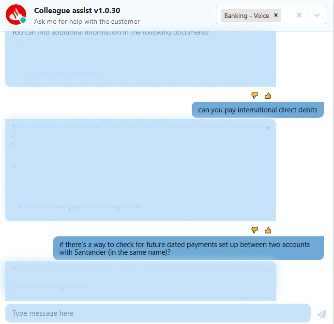
The audience selection menu was at the top of the screen, but the query was entered at the bottom. There were no prompts to select audience, so users often forgot.
Heuristic analysis
No guidance
It wasn't clear that users should select an audience or how important it was to give feedback.
Simple errors
The audience selection was out of place, the feedback icons were wedged between responses and don't get me started on colour contrast.
Dated UI
Internal projects never seem to get UI designers involved, and it showed. This tool was in pilot, but it only need a few tweaks to improve it!
Unclear feedback journey
The icons were there, but users weren't clicking them. Perhaps the feedback journey wasn't clear enough?
Define
"Colleagues are not selecting their business area (audience) when querying Colleague Assist and the feedback rates are really low. This causes Colleague Assist's responses to be less accurate and prevents the data science team from improving the model."
The feedback problem:
Users want to leave feedback about why the chatbot was wrong, but they only get three options which are too broad. This means they don't get to share their true thoughts and feelings so drop off the journey.
Cassi uses feedback to improve it's responses, guard railing those that receive multiple thumbs down. This is really important to reduce risk so feedback is vital.
Users were frustrated by the discrete options. I needed to look at how receive to feedback to inform the model.
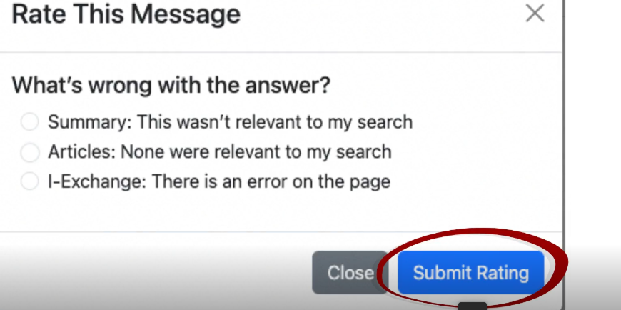
Additionally, the thumbs up and down were not clearly signalled, so it's likely people would miss the start of the feedback journey.

The understanding problem:
Users do not have a good mental model of Colleague Assist. This means they do not understand the value in reviewing responses or realise that this can improve the model for their benefit.
It was obvious from the town hall meeting that users did not know their feedback would directly improve Cassi's responses.
There was a knowledge gap that I needed to address in order to get buy in from users.
The audience problem:
User's are not selecting their audience regularly enough. This causes responses to be guard railed for being wrong when really they were just shown to the wrong audience.
The layout of the tool did not make sense, there were no prompts to choose an audience and no guidance for new users.

There needed to be a clearer journey and guidance for users to select their audience. This needs to be second nature as all queries should be filtered by audience.
Ideate
I was riding solo for this ideation phase. There were only three days before I needed to handover designs to developers so I had to move quickly and get mock ups ready super fast!
If only I had somewhere users could leave their feedback...
I had built a good relationship with the Community Forum team, so I enquired about creating a new feedback forum for Colleague Assist.
They said yes!
It was agreed that Community moderators would monitor the forum and triage feedback to the Colleague Assist team.
The discrete feedback options were gone, and even better... the Community forum was free!
Plugging the knowledge gap
Tooltips and a proper introduction
I had noticed a complete lack of guidance on the tool. When colleagues were onboarded they were given training, but due to knowledge fade some might not recall the basics.
Tooltips are commonly used to provide context where a user needs support. I thought this would be a great way to keep things concise and provide key information.
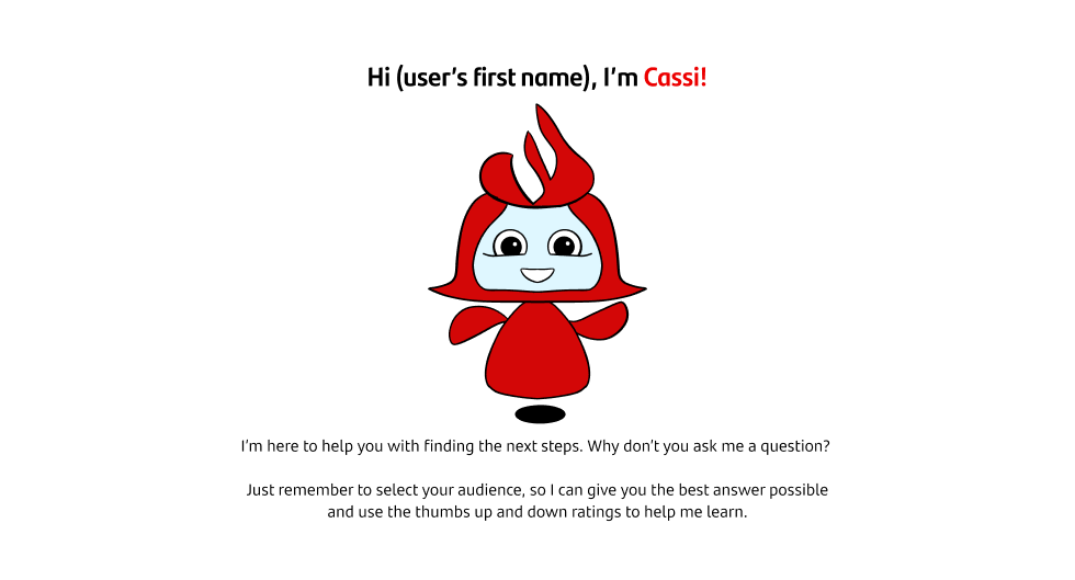
When users first open the tool there is a big empty space in the window, could we use this to provide some initial guidance?
What about the audience filters?
Move it!
The positioning of the menu did not clearly signal that an audience needed to be selected. The audience filter menu was positioned at the top of the screen, far away from where the users enters the query.
Would moving the audience filter menu closer too where a user enters the query be enough? The law of proximity would indicate yes, so I thought I'd try it out...
Prototype
A clearer starting point for feedback
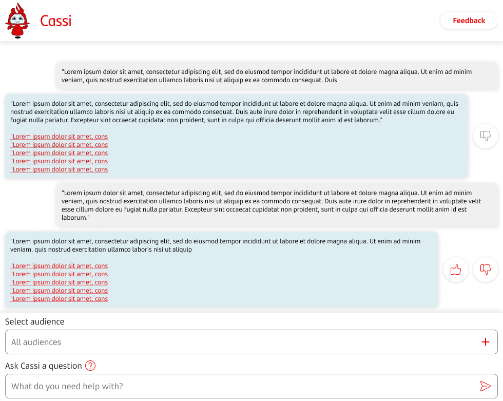
Adjustments made to the thumbs up and down UI made the feedback journey stand out more.

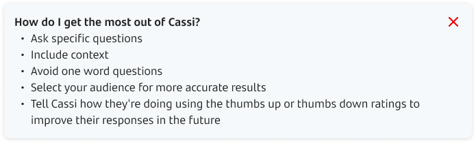
A new tooltip
By providing the key information in a tooltip it meant that colleagues always had the information they needed to use Colleague Assist.

It included advice on queries, the importance of selecting audiences and leaving feedback.
A new introduction
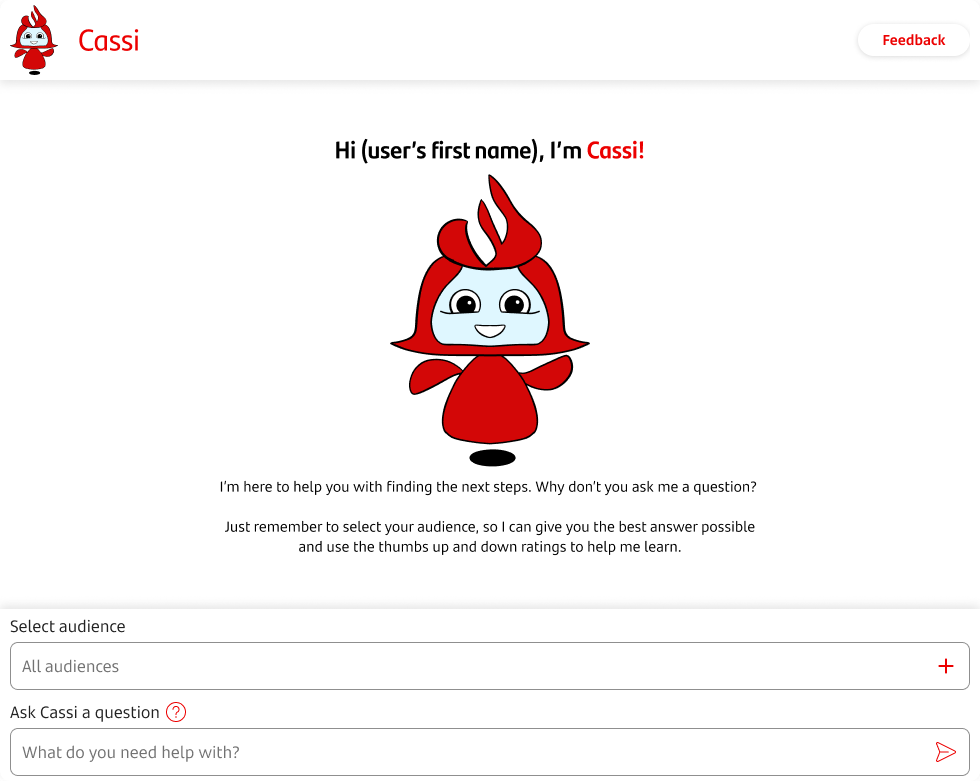
The empty space was now welcoming and provided some quick guidance on best practice when opening the tool.
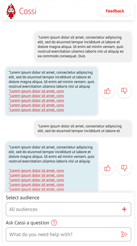
A new home for audience filters
By putting the audience selection directly above the query box this made it more obvious that the user should select their audience before entering their query

Just in case, I provided a prompt if users enter a query without an audience.

Test
I was on my final day before handover so quickly put in some group calls with users to check my design choices.
Rapid validation
Users thought it was a big upgrade and they really liked the new option for feedback!
Colleague Assist was always a web based tool, however I learnt that many users were minimising their screen to take up a slim column on the right hand side. This meant they could use other windows while serving customers.
Last minute changes
The screen needed a smaller break point to allow users to reduce the width. By reducing the size of the logo in the top bar and reduce spacing lower down, there was space to fit the chat window. I made sure that larger screens weren't impacted by this, but it went down to the wire!
Toast or overlay?
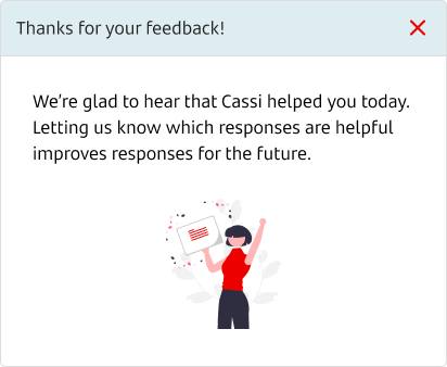
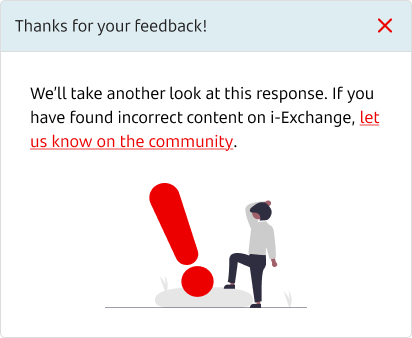
I had created two ways of displaying the feedback journey, one was an overlay that the user would need to dismiss. The other was a toast that would appear for 10 seconds at the top of the chat window.
Users were far more keen on the toast, they made an excellent point that they would be speaking to a customer live in most cases, so overlay pop ups would really get in the way of them providing good service.
Toast it is!
The toast was the preferred option to appear when the user selected thumbs up or down.

Maybe next time overlays...
We decided not to go with the overlays as colleagues felt they were too intrusive and would get in the way.
The final product
Cassi
Audience
Moving the audience field and adding a prompt made it much clearer that it needed to be selected.
Tooltip
A simple tooltip held guidance for new users without getting in the way of colleagues that knew what they were doing.
Feedback
Users had a clearer path to mark responses and share their thoughts. The new toast went down a treat!
Rebrand
By engaging with our community, we had a new logo, new name and better brand for Cassi.
Results
Did I deliver in three weeks?
Right on time!
The changes were delivered just before the change freeze and received plenty of positive feedback on the new Community forum page.
A month after release, audience selections were close to 100% adherence and the feedback count was higher than ever.
Best of all, I managed to achieve this with no additional development cost.
Community support
By providing a dedicated forum for colleagues, they started sharing their thoughts and we were able to increase feedback engagement.
Experienced colleagues were helping out new starters and we gained more context for bad responses.
Often, the feedback would be about a process on i-Exchange. Now i-Exchange managers had the information they needed to improve processes.
The message was clear
The new thumbs up and down UI clearly signalled the start of the feedback journey.
The tooltip and toast provided colleagues with the guidance they needed. We also linked up with training teams to communicate this further.
Combined with the new forum, these changes meant that we saw feedback rates increase by 30%.
Adherence improved
Prior to the update, 1 in 3 guard railed responses did not have an audience selected.
In the first month following Cassi's deployment, there were 30 guard railed responses. In all cases, the user had selected their audience.
This was a marked improvement and meant the team were spending more time reviewing the responses that really needed their attention.
And the winner is...
The competition to design a new logo went down a hit. We received dozens of submissions and even a new name suggestion! The designs were shown to a panel of judges.
Cassi was born!
The winning design: Aishat Arowosegbe won a competition by designing this logo for Cassi.

Retrospectives
Let's take some time to talk about how things could have gone a little smoother.
Being adaptable
This project really highlighted to me that you can still create great products without going by the book. Of course, if I had time to carry out comprehensive research and better testing then I would have preferred to, but constraints often prevent this.
Having the adaptability to go off track to deliver value sooner is sometimes the right choice and in this instance, it paid off!
Make everything responsive
I made the assumption that I was building for a web screen. This was a bad assumption!
Finding out about the minimised view so close to handover was almost a big problem. This taught me to set up all of my designs to be responsive for web, tablet, mobile etc.
Putting my bias aside
I had my own thoughts about the overlay vs toast decision. I would have much preferred the overlay, but when my colleagues made it clear that it could hamper their ability to serve a customer it was an easy choice.
That's all for this case study. Fancy another?
i-Exchange
Knowledge Base Overhaul
Rentokil
Technician's Sales App

Community
Support Forum Project

What's Colleague Assist?
Colleague Assist is an AI chatbot that provides Santander colleagues with guidance on how to serve customers. It uses i-Exchange as it's source of information to provide answers.