Community
Support Forum Project


Summary
Stuck for time? Here's a quick run through...
How did I get involved?
My work on i-Exchange was getting noticed. The Product Owner approached me and asked if I could look at ways to improve the Community support forum.
What was the problem statement?
"Community is getting more popular, we want to make sure we're ready to scale up. We have problems with load times on the home page and we want to make sure we're celebrating our biggest contributors."
What did my research show?
There were problems with content relevance as posts didn't expire, issues with load times due to excessive information on the home page, and a lack of recognition for top contributors.
Why does this matter?
When processes fail, Community prevails. When there is an edge case customer or a unique scenario, there is a wealth of knowledge available to support colleagues and customers to make sure the right outcome is delivered.
What did I do?
I hid outdated content by setting an expiry for posts. To reduce load times, I removed excessive live data from the home page and changed the leader board data to refresh once per hour instead of on each page load.
For leader board recognition, I built a dedicated space to celebrate top contributors. Now users had an incentive to boost their score.
What was the result?
A fully redesigned home page and post submission form brought Community in line with the internal design system.
Load times reduced to three seconds. This equated to a 97 hour time saving each month across the operation.
The new medal system for recognition was well received by colleagues. They finally had a place on the podium to motivate engagement.
Post expiry is still pending, however I found a workaround to bulk expire posts which provides a similar level of benefit.
Background
How did I get involved?
Welcome to Community
We've all been there. Looking for answers on Quora or Reddit for an expert to to give us answers to the world's mysteries.
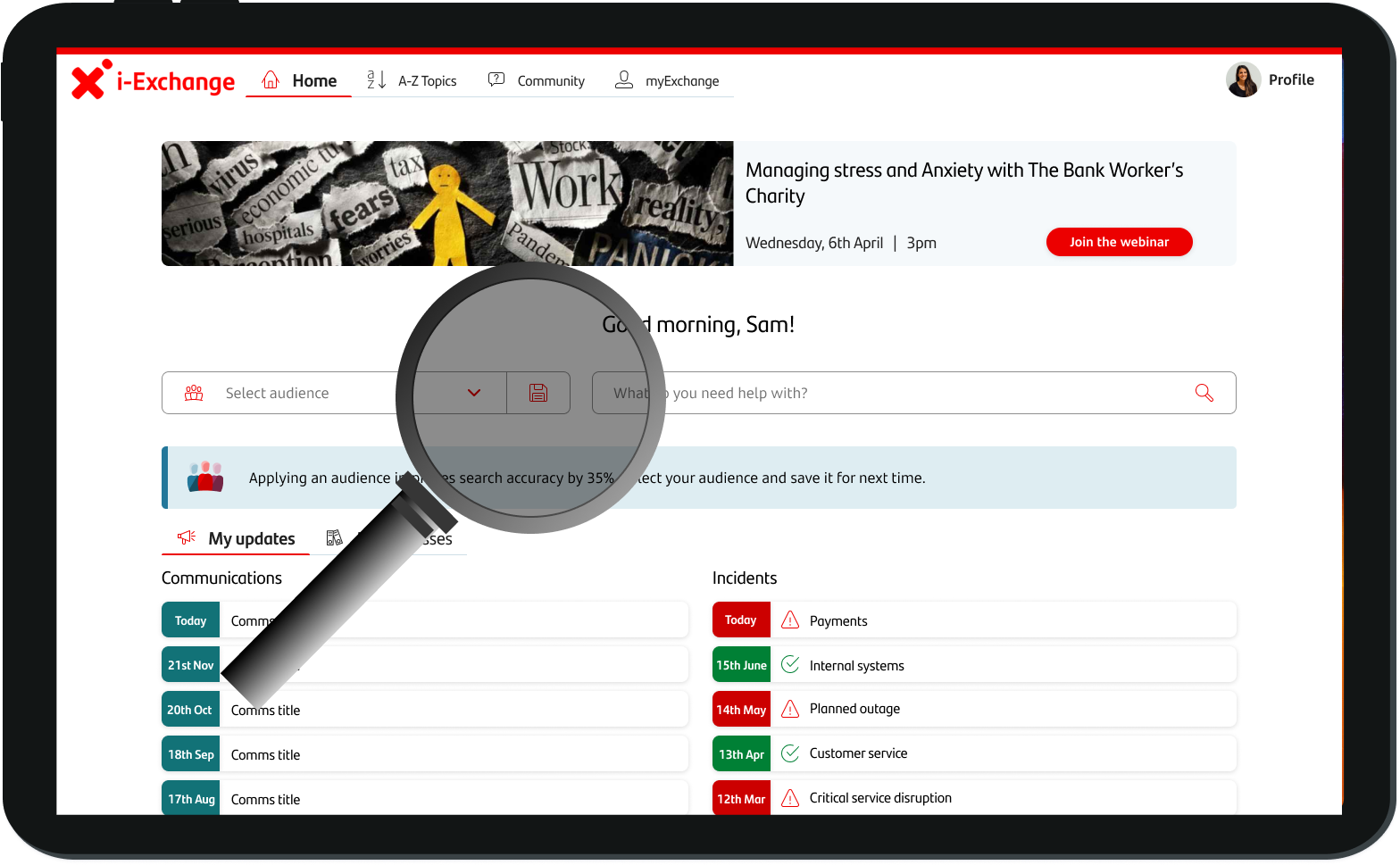
Community is like that, except it's for Santander colleagues looking for help. It's an integral part of colleague support, and a vital component of providing good customer outcomes.
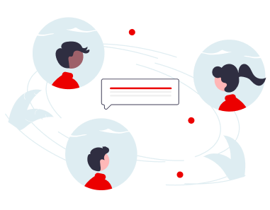
Existing within the i-Exchange knowledge base, Community started as a pilot project and soon gained traction. Now it sees over 1,000 posts a month.
With Community growing rapidly and more business areas joining in, the Product Owner reached out to me after seeing my work on i-Exchange.
What's the problem?
"Community is getting more popular, we want to make sure we're ready to scale up. We have problems with load times on the home page and we want to make sure we're celebrating our biggest contributors."
- Danielle, Product Owner
Community by nature
I was busy deploying updates to i-Exchange, but I wanted to make sure Community received the attention it deserves.
This was an opportunity for me to show leadership skills and delegate effectively.

I reached out to three Community moderators to see if they could support with some UX research.
Help arrived!
Samantha

Samantha is really good with people. She wants to sit down and talk to understand problems. I knew she'd be amazing at user interviews.
Lee

Lee is really technical, he loves to analyse to understand things. We needed to do competitor analysis and Lee was perfect for this.
Bonny

Bonny is great at finding answers. Her understanding of face to face banking is second to none. She set up observations with branch staff.
Empathise
Surveys
Samantha, Bonny and I worked together to create a survey to send out to all staff. We focused on understanding our user's goals and pain points.
Competitor analysis
Lee looked closely at other support forums like Reddit and ServiceNow Community, he identified key differences where we could add value.
User interviews
Samantha interviewed contact centre and live chat colleagues. She explored the issues of content relevance and how we can promote Community.
Observational studies
Bonny spent time in branch doing some usability testing and observational studies. She found a shocking truth about our load times.
Research findings
Once we had completed each research piece, we came back together and shared the key insights.
Outdated content
Posts from years ago were dominating the search results. Content goes out of date very quickly and old posts really get in the way.
Long load times
The load time for the home page was too long, often up to 10 seconds. This was the perfect way to lose engagement and get on people's nerves!
Recognition
Community members were awarded badges and positions on the leaderboard but top performers weren't being celebrated.
Mismatched journeys
The most useful menus were held elsewhere on the website and the 'Ask a question' page didn't make sense.
Heuristic analysis
Community Home
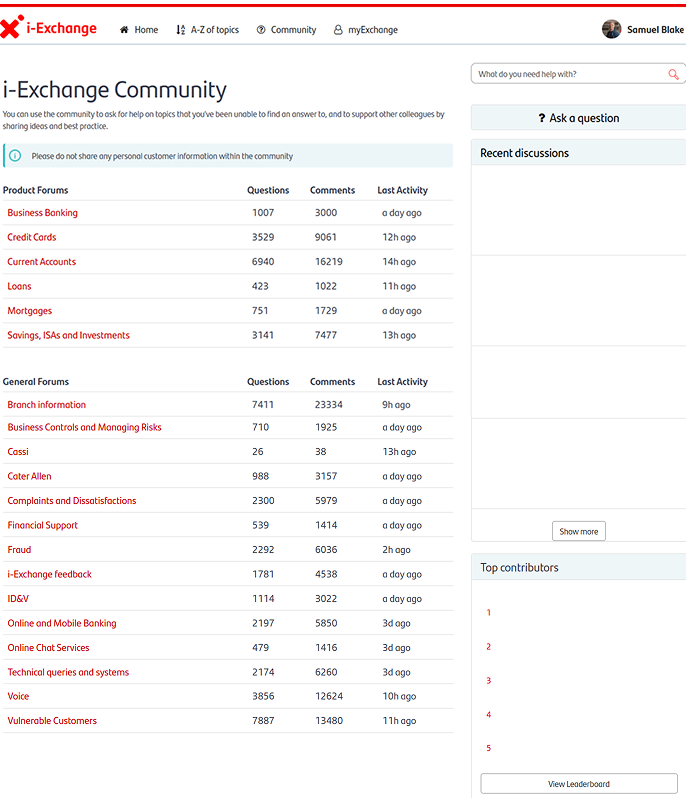
Too much information
The information on each forum, recent discussions and live leader boards were causing excessive load times.
Missing menus
Key menus like 'My network', 'My posts' and 'Achievements, were held on a separate page on the website. Why weren't they shown on Community?
Hidden leader board
One of our biggest drivers for engagement was users collecting their points, why do we only give them a tiny portion of the home page?
No questions
This is a support forum, but there are no questinos on the home page? Our competitor anaysis revealed this major flaw.
Poor use of space
There was a lack of direction with the home page. The page doesn't match 'F' shaped reading and the information architecture was poorly designed.
Forums galore
Each forum had a purpose, but we needed to find a better way to display them. A 'General' category doesn't count as effective grouping.
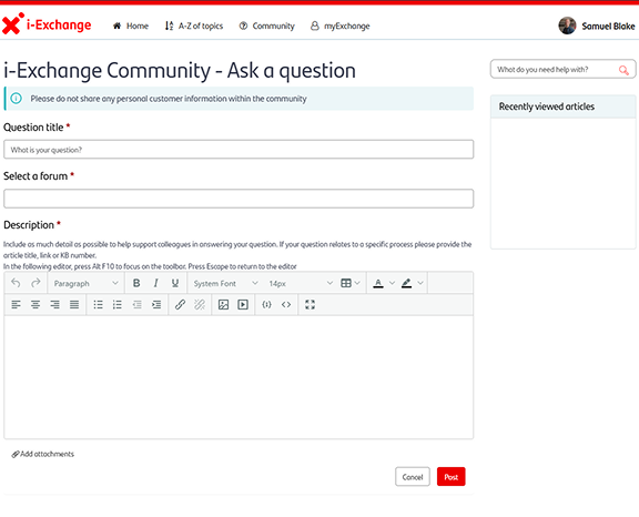
Ask a question form
Missing references
Most Community posts relate to a process on i-Exchange, but the reference for the process was often missing.
Ignored displays
The 'Recently viewed articles' on the right were supposed to prompt getting the i-Exchange reference, but these were often ignored.
Poor signalling and discoverability
Users are able to add attachments, but it's not well signalled. There are often complain that they can't do this, but really they just can't find it.
Excessive explanation
The instructions were too long to read and the text was tiny! This copy needed to be simplified.
Define
The old post problem
"The search list is full of posts from years ago, the answers provided then don't help me today."
When checking if the question has been answered before, how do they know that a four year old answer is still correct?
Community has been active since 2021. Posts had never been removed and they were going up in number rapidly. There was no existing process for removing old content.

We needed to strike a balance between keeping posts relevant and not taking away the huge amount of knowledge available in the previous answers provided.
The loading problem
"When users come to Community they wait an age for content to load, when it finally loads they're getting on with something else."
It was obvious why we had a loading problem. The homepage displayed the forum name, the number of questions, number of comments and last activity for 20 forums.
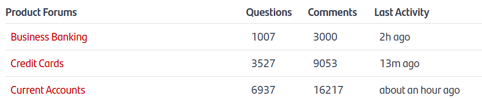
Loading 4 years worth of information is not necessary.
When speaking to users they did not find the information useful, however the product owner and moderators were keen on keeping it.
The recognition problem
"Our users compete for the top of the leader board, but we don't celebrate our top performers enough. How do we recognise them?"
Gamification was a big part of Community development when it first launched. It worked really well!
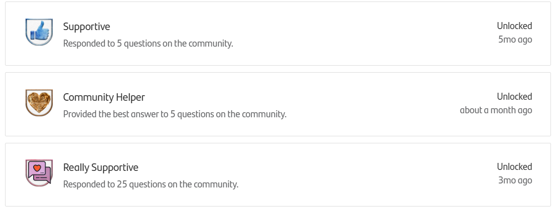
Users loved the points and badges they collected, so I wanted to build on this and celebrate those that contribute to the forums.
I had all the data I needed, but I didn't want to trade off with load times.
The missing menus problem
"Key information for Community is held on myExchange and when I want to give feedback I'm told to ask a question. None of this makes sense!"
Community network, previous posts, profile, achievements and notifications are all held in myExchange, a separate section of the i-Exchange website.
There are two feedback forums, but the prompt tells the user to 'Ask a question', this does not make sense for users when they're trying to give feedback.

We needed to review the key journeys to organise our content correctly and make sure our forms were clear.
Ideate
I scheduled design mobs and workshops with Samantha, Lee and Bonny to ideate solutions for the problems we had identified.
Posts needed to expire, but what if we lost helpful information?
A logical solution to outdated content is for it to expire. We had to decide between reviewing 50,000 Community posts manually or setting all posts over a year old to expire automatically.

Automatic expiry was the best option, but we needed a contingency in place.
We agreed a control for expired posts, allowing moderators to reactivate posts if required.
Push back on expiring posts
The post expiry request needed to go through a global ideation forum.
Santander UK were the only group using Community, but we needed votes from the other countries. Why would they vote for something that doesn't benefit them?

We gave ourselves the best chance by building a strong business case to share with the UK Platform Lead, but we weren't optimistic.
We got to work on a plan B, instead opting for a bulk update to expired posts each month. One way or another we were going to clean up Community!
The home page data had to go
Community home needed cleaning up. The table of data on the home page wasn't helping our frontline colleagues and it was the right choice to remove it.

The product owner and moderators weren't sure, but once I'd made the case for improving the load times they agreed the trade off was worth it.
I had some ideas for how we could use the space and users were really keen on the designs.
More data problems with the new leaderboards...
After finding a solution for the load times, the same problem appeared when looking at leader board data.
If we looked up all of our user's total points it would likely take forever to load!

I had to compromise here. If the data refreshed every hour it wasn't necessary for the system to look up all users on every page load.
Moving menus
Below are the old tabs on myExchange, a separate i-Exchange page. I simply lifted them onto Community home, redesigned the UI and preserved the most useful information.
'Favourites' were staying on myExchange, 'Events' were removed and iconography was added to make the options easier to distinguish.

New forms and missing menus
We carried out a workshop to ideate solutions for the forms, prioritising ideas that required less effort from developers, as our resource was limited.
The two new forms and shiny new tab section on the home page made our journeys much easier to follow.
Prototype
Extra space
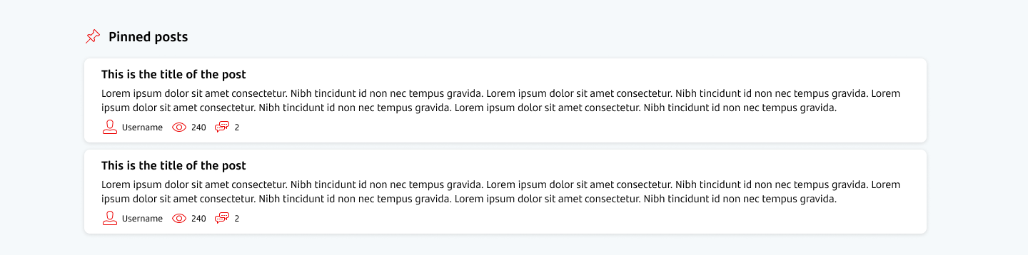
With the forum data removed, there was plenty of real estate available on the home page. I thought it was odd that a forum didn't have any posts immediately available, so I created a new pinned posts section for moderators to promote certain posts.
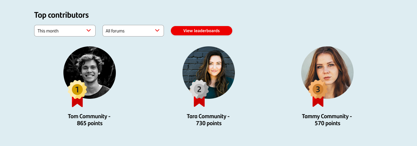
Working leader boards
By working with the data I already had available, I was able to save on development time.
The new leader board section was eye catching and made our user's feel like their efforts on Community were finally being recognised.
New home for the missing menus
The new tabs were placed exactly where they belong. Providing users with the information they needed on Community without sending them to myExchange.

Simplified forms
By amending the copy and adding some visual indicators, we were able to signal the purpose of each forum. Feedback forums had a 'Give feedback' prompt, while support forums were headed 'Ask a question'.
This was just one part of the form redesign. Scroll down to see the whole form UI!


Test
Loading times
By setting up a reduced version of the existing home page in the test environment, I was able to check how much the load times improved when the forum data was removed.
Across my team, load times now averaged 2-3 seconds. However, I knew from experience that test environment load times don't always reflect the production environment.
Additionally, this didn't factor in my changes which were going to add a variety information to home.
That said, it was a good indicator we were going in the right direction!
Old posts impact
I ran a test where I removed the majority of older posts and checked five common search queries. The results were far more relevant with all the old junk removed!
New forms
Running a focus group to look at the new forms found that users were much happier with the new layout, and the ability to select an article reference was welcomed. I hadn't changed anything big here, but was glad to receive the positive feedback.
Recognition
We spoke to some of our top users, and some users who used to be more active but had dropped off. We wanted to know if the new leader board display would be enough to incentivise them to engage more on the community.
Generally, people were more inclined to compete, and the break down at a forum level meant that users could compete locally within their teams. I hadn't appreciated how much people were bought into winning a leader board spot on Community!
The final product
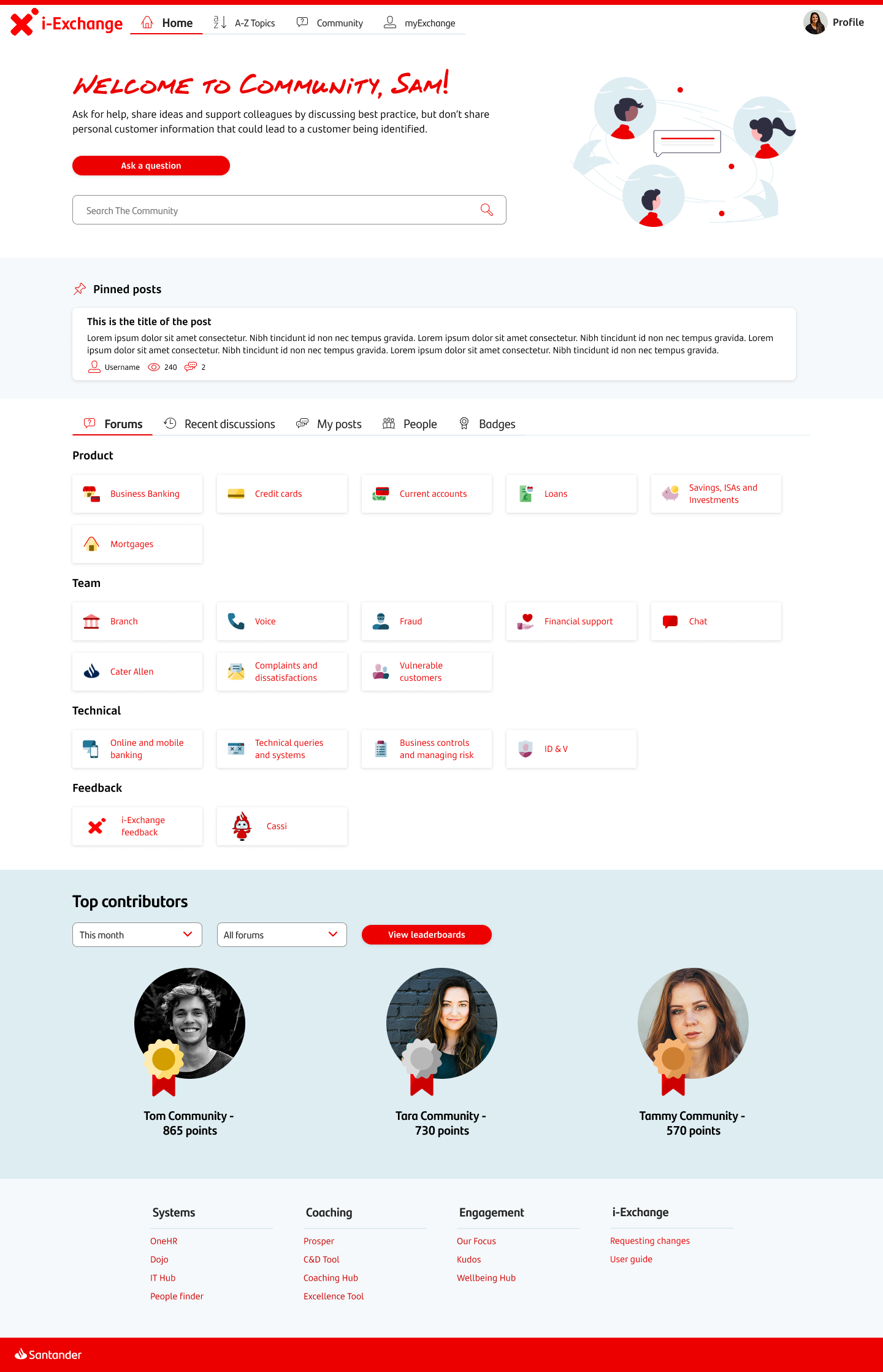
Community Home
New hero section
A brighter hero section welcomes the user and immediately offers the key journeys of posting and searching.
Pinned posts
Making some posts front and centre meant getting more eyes on the biggest posts.
We found the menus!
Missing menus had a new home. Now Community members had everything they need in one place.
New forum display
We threw out the big list, and replaced with clearly organised forums. We used card sorting with users to define these.
Top contributors
I expanded the leader board section, including the ability to see the highest scoring users on each forum.
New structure
We changed the structure to match an F shaped reading pattern and improved our information architecture.
Ask a question form redesign
New intro
The new intro section gave the correct context and could be switched to give feedback depending on the forum.
Related articles
A simple look up menu allowed users to reference processes from i-Exchange.
Clear instructions
Instructions for writing a post were reduced and bulleted. This made it easier for users to do what they came here to do!
Signalled attachments
Providing a new section for attachments meant that users could easily share files when they needed to.

Results
By removing the excessive home page forum data, it was no surprise that our load times improved. The estimated time save was 5 seconds for every page load, equating to 97 hours saved each month.
A fully redesigned home page and post submission form brought Community in line with the internal design system.
The new medal system for recognition was well received by colleagues. They finally had a place on the podium to motivate engagement.
Post expiry is still pending, however I found a workaround to bulk expire posts which provides a similar level of benefit.
I don't have any further information on how the site performed following the update as I moved on from Santander soon after this project.
Retrospectives
Let's take some time to talk about how things could have gone a little smoother.
I don't need to do everything
Knowing my capacity is important. If stretched too thin, then the quality of my work suffers (or takes longer). Understanding what I can delegate or get support with can lead to better outcomes for everyone.
Keep it simple, stupid
I know this adage has been around for a long time, but I found it especially relevant for this project. I didn't need to redesign the wheel. Simply relabelling, changing graphics and moving things around led to really good outcomes for the platform and were low cost for the business. I've previously found myself starting from scratch on every project, but often we can work with what we have.
We don't always get what we want
It was a real pain when we got push back on the expiry of posts. Realistically, I don't think an automatic expiry function will be added. That said, the solution to bulk update posts once a month/quarter is good enough. I was able to pivot to a similar solution quickly and didn't lose sight of the goal which was improving relevance of the posts on Community.
That's all for this case study. Fancy another?
i-Exchange
Knowledge Base Overhaul
Rentokil
Technician's Sales App

Colleague Assist (Cassi)
AI Chatbot Feedback Journey

What's Community?
Community is a forum for Santander colleagues who need help serving customers. It's there to support when normal processes aren't enough and has become a vital component of providing good customer outcomes.