Rentokil
Technician's Sales App


Summary
Stuck for time? Here's a quick run through...
What's Rentokil?
Rentokil is a global pest control company. They provide pest control and hygience services, mostly direct to other businesses.
How did I get involved?
As part of my final project on Rentokil's graduate scheme, I was challenged to 'find an innovation that would save money for the business'.
I recognised an opportunity to improve a lead generation app used by technicians to submit leads to surveyors.
What did my research show?
The app had three key users: technicians, surveyors and managers. Each user had different needs, so I scheduled user interviews to identify their key problems.
Technicians: Entering all of the customer's information manually and then lack of engagement from surveyors on submitted leads. Many technicians submitted 'throw away' leads to hit their KPI of 2 leads per month.
Surveyors: The information in leads was often wrong, so they just called the customer anyway. Technicians didn't bother to include key information and it's not easy to find the technicians contact information.
Manager: Technicians kept calling to check their number of submitted leads, he wasn't sure why technicians couldn't check this themselves. Additionally, he was constantly correcting admin errors for duplicated customer records.
What was the problem statement?
Key information is missing that should be shared on the customer's sales journey. This is because the app doesn't promote teamworking between technicians and surveyors causing missed opportunities for sales.
Why does this matter?
A huge portion of Rentokil's sales come through direct leads from Technicians. If they can't signal new leads easily there are missed opportunities for the business to generate revenue.
What did I do?
I designed new prototypes to support with the key pain points for each of my user profiles, but they weren't up to scratch.
I found a UX mentor willing to help and signed up to an online UX Design course. With the additional support, the designs improved and the app that was fit for purpose.
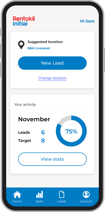
There was a new log on journey, a dashboard to display leads progress for technicians, new forms to make sure surveyors received the information they need and a mechanism to prevent duplicated records
What was the result?
I reached out to a developer who estimated that the build would cost around £80,000.
The head of sales confirmed that the existing app generated £4 million in revenue each year.
With the above two pieces of information I estimated the cost benefit of the app. Assuming a 5% increase in revenue, it would generate £120k profit in the first year.
I went forward with the above figures and presented my ideas to senior leaders. They agreed that the project was a great idea and added to the product backlog for delivery.
Background
How did I get involved?
UX in pest control?
Let me take you back to November 2020. I was on Rentokil's innovation graduate scheme and needed to 'think of an innovation that would generate money for the business'.
I racked my brains for days, but wasn't sure where to start!
Then it hit me while I was ordering breakfast on the Wetherspoon's mobile app...
"Why doesn't Rentokil's sales app work as smoothly as when I order breakfast?"
My breakfast revelation wasn't just a passing thought, we had a lead generation app but it was a nightmare to use.
I knew that improving it would help sales, but at this point I had never even heard of UX!
Empathise
I decided to give 'UX' a go, soon discovering Figma and some helpful guides on YouTube.
First, I needed to get to know my users.
Scheduling interviews
I knew plenty of technicians, surveyors and team leaders. I reached out to a few and set up interviews to understand their biggest frustrations.
Technician
Frontline pest controllers. If they spot an opportunity to sell a service or product they raise a lead on the app.
Interview insight
"Submitting leads feels like a waste of time, most surveyors don't bother following up anyway!"
The technicians told me that they only cared about hitting their KPI of 2 leads submitted per week which was linked to their annual bonus.
If the process to submit a lead was easier they would consider doing it more often, but it took too long to do when their diaries were already really busy.
The major obstacles were entering all of the customer's information manually and then the lack of engagement from surveyors on submitted leads.
Surveyor
Pest product salespeople, if they receive a lead on the app, they follow up with the customer and quote for the necessary products and services.
Interview insight
"I never get good information from technicians, it seems they're just submitting leads for the sake of it."
The surveyors told me they don't bother with information the technicians submit as it's often wrong, so they just call the customer anyway.
Something as simple as the customer's preferred contact times would make a huge difference.
Team leader
The glue that keeps technicians and surveyors together. They line manage and support the team to get the work done.
Interview insight
"I'm constantly doing admin to sort out mistakes and give technicians updates on their KPIs."
The team leader was frustrated that people kept calling him to check their number of submitted leads for that month, he was the only one with access to the data but he wasn't sure why technicians couldn't check this themselves.
They have to access a system on their laptop to find the technician's contact number, but it's not easy to do when out visiting customers.
Define
Understanding the problem
They were constantly having to correct admin errors where technicians were duplicating customer records. If the technician couldn't find the customer in the CRM, they would just brute force the data entry.
Ideate
I knew what I was dealing with, now I needed to create a product.
Getting ideas down
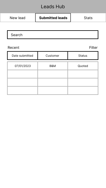
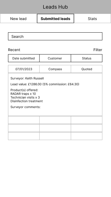
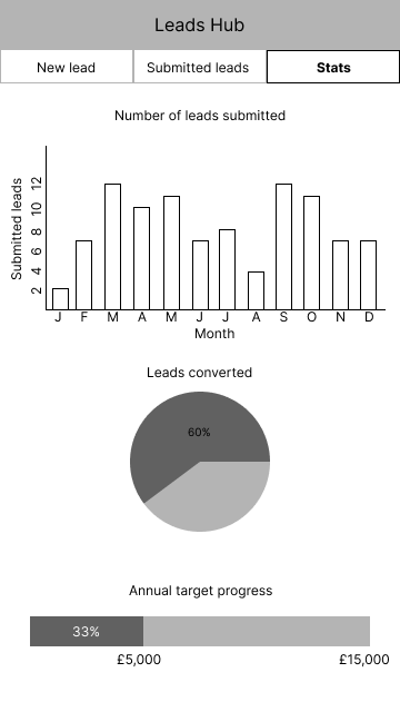
I wanted to tackle the technician's difficulty entering information, the surveyor's preferred contact times and the team leader's need to update technicians on their KPIs.
I decided to try wireframing some ideas.

Then adding some colour...
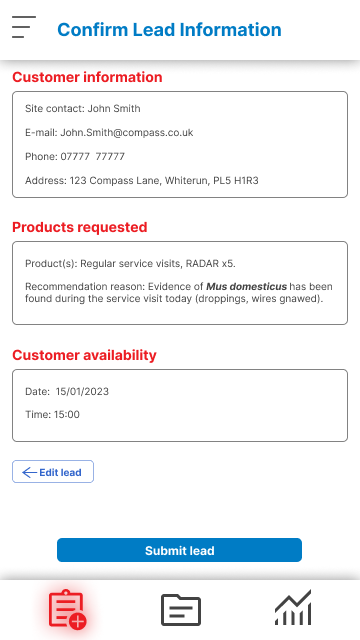
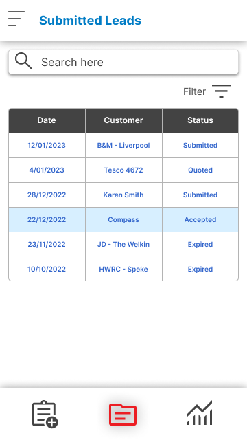
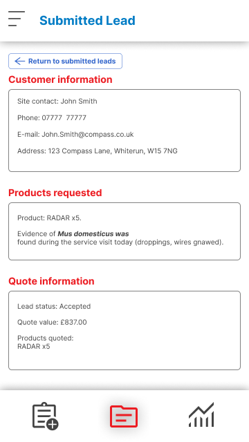
I was confident with my initial designs so I decided to add a splash of colour and more UI elements.
.png)

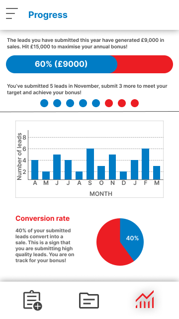
Prototype
My UI skills weren't quite there
I had looked at some similar apps and it was obvious I was leagues behind the competition. I needed to call in support and brush up on my UI skills.
Mentorship
I knew a platform called ADPList offering mentorship with UX professionals so I booked in a meeting. I was eager to hear my new mentor's thoughts!

Education
I found a course online that I could complete to work on my UX and UI skills. Auto layout was giving me a serious headache, so I knew I had lots to learn!

Collaboration is key
I'd started my course and was getting to grips with Figma. My new mentor, Lee Jeffery, went above and beyond by organising a 'design mob' for us to have a look at improving the UI for my project.
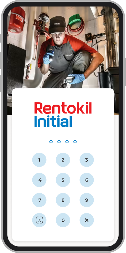
Together we created a UI kit and he highlighted that I'd missed key log on and onboarding journeys.
We were able to get the app looking much better.
Levelling up the UI
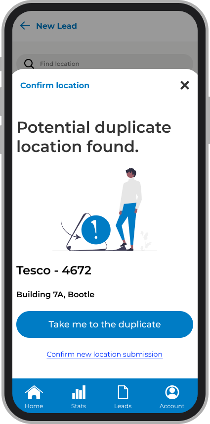
Landing page shows leads progress and location support for customer sites.
New login process allowing face recognition, fingerprint, and PIN set up.
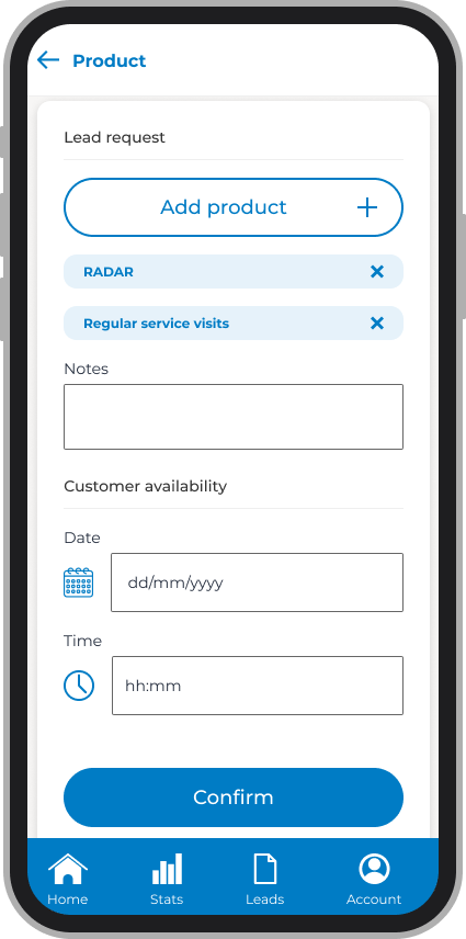
Surveyors know what the customer wants and when they're available.
Prevent duplication with a look up function reducing admin for managers.
How do I build it?
After testing the app with the colleagues I'd interviewed before, it was time to figure out how to turn it into a functioning product.
I shared the designs with my manager and asked for pointers on how to move the app into production.
They suggested to work out the cost and the potential benefits, so I reached out to the IT team and head of sales.
Cost
A developer agreed to review my designs and provide a rough build cost...
£80,000
I thought this was a huge sum at the time.
Looking back, I'm sure it would be more. In any case, this was the figure I took forward to assess cost.
Benefit
The head of sales told me how much revenue the existing app generated...
£4 million
If app revenue increased by a fraction, it would pay for itself in no time.
Now to convince the IT team to take it forward!
Results
Sharing my idea
I couldn't wait to share the app with the rest of my graduate programme and senior leaders.
I presented the research, the problems, showcased the new UI and discussed the costs and benefits.
The project was well received and I was asked to send my design files over to the IT delivery team.
The reality of business constraints kicked in.
The IT team were busy putting out fires, so the project was added to a very long product backlog. This took the wind out of my sails, but was a real wake up call to understand constraints before taking designs further.
However, I had successfully started building one thing.
This was the first step into my UX career!
Retrospectives
Let's take some time to talk about how things could have gone a little smoother.
That's all for this case study. Fancy another?
i-Exchange
Knowledge Base Overhaul
Colleague Assist (Cassi)
AI Chatbot Feedback Journey

Community
Support Forum Project

I'm currently iterating on the content in this case study... proceed at your own risk.